Problem
Vibhor Foods needed a clear and credible digital presence to introduce their new FMCG product line, but they had no existing platform to support brand discovery. As a new entrant, the absence of a structured website made it difficult to communicate product quality, showcase variants, and build early trust with consumers. They required a clean, consistent, and intuitive experience that could present their products with clarity and support future expansion as more SKUs are added.
Solution
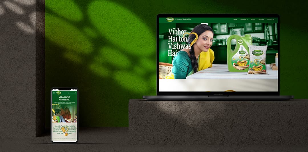
We built Vibhor Foods’ website from the ground up with a streamlined interface that simplifies product exploration and strengthens brand perception. The new platform enhances navigation, improves mobile responsiveness, and creates a frictionless browsing flow that helps users understand offerings quickly. A scalable Laravel backend ensures stability, easy content management, and future growth, enabling Vibhor Foods to operate with a strong digital foundation from launch.
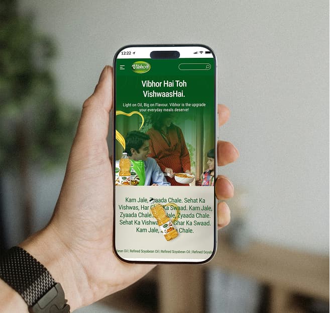
The redesigned Vibhor Foods platform allows users to explore products with clarity, understand ingredients and benefits effortlessly, and move through the browsing journey with minimal friction. Built with lightweight HTML for faster load times and a responsive structure across devices, the platform delivers a smooth, reliable experience for first-time visitors. The Laravel backend ensures easy content updates, supports additional product lines, and maintains performance as the brand grows, enabling Vibhor Foods to deliver a consistent digital experience across all touchpoints — from awareness to product discovery.
Year
2025
Timeframe
10 weeks
Tools
UI
UX
Design
Frontend Engineering
Backend Architecture
Industry
FMCG
01
Project Timeline
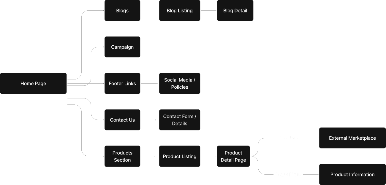
Vibhor Foods’ journey began with a focused discovery phase, followed by defining the information architecture, crafting a clean visual direction, and building the frontend and backend foundations. Each stage moved toward creating a simple, trustworthy, and mobile-first experience that supports product visibility.

02
Discovery Phase
<p>We analysed Vibhor Foods’ brand goals, target audience, product positioning, and launch requirements to build a clear roadmap for the website. This included understanding user motivations, identifying what consumers look for in new FMCG brands, mapping simple product discovery journeys, and reviewing the existing packaging and communication cues. We also benchmarked competitors across the D2C and FMCG landscape. The insights helped define a structured scope focused on creating a clean, trustworthy digital presence that highlights product quality, simplifies browsing, and delivers a scalable foundation for future SKUs.</p><div><br></div>
competitors we researched


03
User Persona
The discovery phase helped identify key user groups with distinct motivations and expectations. These personas shaped decisions across navigation, content clarity, product presentation, and trust-building elements essential for a new FMCG brand.
-1766826837.png&w=640&q=75)
MrS. ANJALI VERMA
Health-Conscious Buyer
24-40
Metro + Tier-1 Cities
Goals
- Understand product ingredients and freshness
- Explore categories quickly
- Make informed decisions without clutter
Frustrations
- Lack of clear product details on new FMCG websites
- Difficulty comparing variants
- Confusing layouts that slow decision-making
Needs
- Clean UI with transparent product information
- Simple ingredient & benefit breakdown
- Smooth mobile-first browsing experience
-1766826837.png&w=640&q=75)
MRs. Rajni Chawla
Household Shopper
28-45
Tier-1 & Tier-2 Cities
Goals
- Trust the brand before purchasing
- View products with clear packaging and pricing
- Quickly find the right product for household needs
Frustrations
- Unorganised product listings
- Unclear brand story or credibility cues
- Slow-loading pages affect buying confidence
Needs
- Structured product catalogue
- Strong brand storytelling
- Fast, reliable performance across all devices
04
User Flow
The research phase uncovered key user groups with distinct needs and expectations from Vibhor Foods’ digital experience. These insights shaped a simplified browsing journey focused on ingredient clarity, brand trust, and ease of product evaluation. The personas guided decisions across navigation, product presentation, and content structure to support both health-conscious buyers & everyday household shoppers.
05
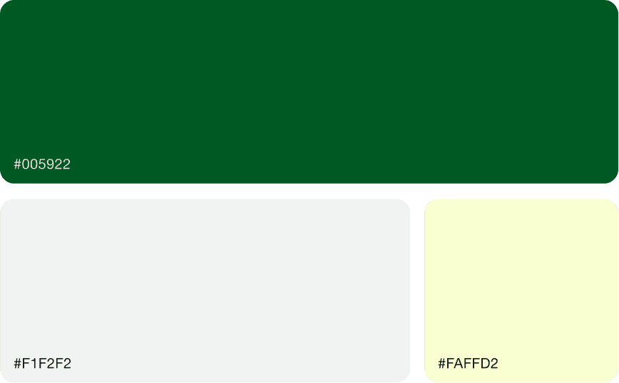
Color Palette & Typography
A refined visual system anchored in freshness, simplicity, and functional clarity. The palette blends Vibhor Foods’ signature green with warm neutrals to reinforce purity, trust, and readability across product-focused content.
Roboto Slab & Roboto Font Family
Typography is powered by Roboto — a clean, versatile sans-serif typeface ideal for modern web interfaces, offering clarity in body text and a consistent visual rhythm across labels, navigation, and product information.
HEADING
Font: Roboto Slab Size: 48 Px Style: Semibold
BODY
Font: Roboto Size: 16 Px Style: Regular Line Height: 25.6 Px
TITLE
Font: Roboto Slab Size: 18 Px Style: Regular
SUBTITLE
Size: Roboto
Size: 16 Px
Style: Regular
Line Height: 25.6 Px

06
Our Tech Stack
Built on a scalable and modern stack: Backend: Laravel for a secure, flexible, and future-ready application architecture. Frontend: Lightweight HTML for fast rendering, quick load times, and SEO-friendly performance.
-1766826837.png&w=384&q=75)

07
The Results
The transformed digital experience enabled Vibhor Foods to establish a strong market presence from launch and significantly elevate product visibility and brand credibility.